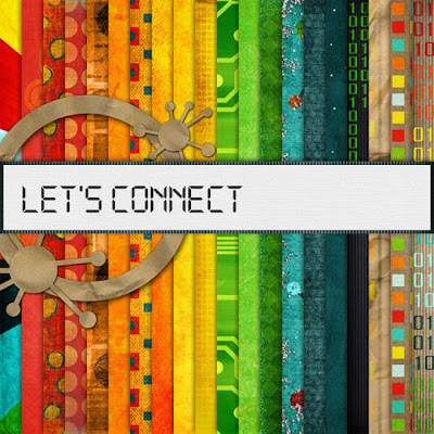


I decided to start off this blog with a collaboration kit from several of the top names in the digital scrapbooking industry along with some fairly new names in the scene. Either way, I am going to show you close ups of at least one paper and element from each designer along with a summary of the overall quality of the items each designer provided to this mega kit of 85 papers and over 140 elements.
Amy Sumrall


Most of this designer's elements are hand made, which is a desirable trade in this market. However she doesn't put quality first and foremost. She needs to clean up the jaggies on her images and be careful for stray pixels. Also, bevels and ridges on elements that could cause an undesirable effect on a customer's finished product are a big no-no.
Ellie Lash


This designer is trying to save your hard drive space but when trimming elements to save space you need to make sure not to trim the element. She nipped off the curves of this button in doing so. She made nice hand pieced together beaded wires, one thing that could be done is shadowing on each bead where the wire "enters" and "exits" each bead.
Flergs

Megs, make sure when doing a large area with styles, that the pattern aligns up!
Franziska Altmann

The shadowing on the hearts and bubbles is too dark making them very hard to work with one plain colors. I had to use one of the patterned papers to showcase the lovebirds on. The lines on the papers are also very jaggy but I think this is the "grunge" feel the designer is going for.
Heather Manning

The bow is outlined by a highlight and/or shadow. The alphabet seems fine. It is an alphabet.
Kim B's Designs

This designer has very good quality elements in this collab kit. The only problem I found was with the above close up she did not extract the white background out from where the wire is looped in the "clip".
Krystal Hartley

This designer has pretty "newbie" basic designs and papers, but the quality is fine.
Lost Gurlz Venture Designs


This designer is really inexperienced. I am unsure how she fits into this "group" of designers. Her elements are basic and unrealistically textured. The shadows are very bright and some are even cut off. Her papers are not textured at all. The clip art she used on the paper above she did not take the time to color correctly.
mgl Scraps

This designer did an outstanding job extracting the string and mirrored tag ring. I find no flaws in her extractions. The textures on her papers are crisp.
Miss Crow

This glitter sputnik is a very cute addition to the kit but it is very blurry. I think this designer needs to replace their commercial use glitter style with a better version. Papers are the same way with the glitter on them.
Moon Scraps

Unique take on the papers for this kit. Elements are doodles and are nice crisp lines with the exception of the mouse with the jagged edges.
Polka Dot Plum (Amy Brever)

Another set of "newbie" designers. Basic designs, but when their papers and elements are placed in a mega kit like this they just fall into place. Nice crisp lines on the journaling paper. The only thing to point on on this half of the team is the brush used to make the paper holes was probably not the best brush for the job as it did not do a very neat job.
Polka Dot Plum (Lauren Faczan)

The other half of the team. They make a good pair. I will definitely be keeping a lookout for what these two are up to in the future.
Sugarplum Paperie

Elements are simple, yet they fit well into this mega kit. Good quality.
Tracey Monette

This designer has a few jaggies on her element and some missing stitching shadows on her paper.
Web Designz by Kristi

The designer has come in and extracted this monitor nicely after the critique and reuploaded the new on into the zip file. Here is a screen shot of the new one where the logo was removed. A corner of the blue monitor remains in the upper right corner and when I printed, it does show, but more as a shadow.
Wenchd Grafix

The wordart is a neat idea, but the shadowing is off to the point that the words appear to float right off the block. Also, a little more time could have been spent to ensure that the squares were not overlapping the dots on the paper causing them to be cut off in three places on the paper.


 Another commercial use product, this time by Karla Marano AKA Karla's Kaleidoscope Designs. This designer sells this product for $2.00 at Divine Digital, with a little cleaning up on a small budget these could be a hit in a heritage kit or a scrapper could purchase to use for scrapping their own family history.


